Monday, 11 May 2015
Question 7
Compared to the preliminary task, I feel it is clear that we as a group have learnt a lot through in particular trial and error. In the preliminary task, we had limited use of a tripod and had many continuity errors.
We made a lot of effort in the creation of our product to avoid these problems however, when we first began filming we did not have access to a tripod and so we seemingly recreated these fluctuations in quality. In the preliminary task, we had only our camera to record audio which we found to be not a good quality so took the decision in our final product to record all of the dialogue separately. This also came as a bonus as when we filmed, we often found that the weather became particularly windy which would have potentially ruined takes.
However, with this came more challenges than the conventional. Lip syncing and mimicking spoken dialogue to match the footage was difficult and has led to many pain-staking sessions of recording audio. Furthermore, in our preliminary task there was little to no background noise due to being filmed in a relatively quiet part of the school. We did not want this in our final product as the effect would seem unnatural and make the illusion of a busy city moot.

This way, we didn't worry about wind changes which would have altered minor yet noticeable details such as trees in the background blowing in a certain direction. Furthermore, all our shots that included Harry playing the character John, wore the exact same clothes solidifying a costume. Also, we made sure that we followed the 180 degree rule to make sure the over-the-shoulder shots remained understandable to the audience.

Question 5
To address our audience we stayed within certain expected conventions within the crime genre. These conventions include mystery, urban setting, undercover cops & so on. From our qualitative research, we opted to have two protagonists who are crime fighting partners as that appealed to our target audience. Predominantly, John is the main protagonist whilst Pedro is more of his partner. As their brief dialogue unfolds it's clear that these two have a good friendship both inside & outside of the police force which complies with the convention that the two crime fighting cops are good friends. The antagonist has prominent appearance which foreshadows his intentions to be villainous. His black cap is shown to be draping over his arms which display connotations of death & destruction and further appeals to both the crime & thriller audience. The climatic large explosion creates an tentious atmosphere which reinforces the appeal to the thriller audience. In terms of feedback, our peers and friends believe it to be a descent attempt at creating a film opening especially since we are not professionals. If we were to do this again, then we would invest in a better quality camera and learn more about special effects that could be applied via software.
Question 4
Evaluation Question 4
Written by group member, Keenan Myers

Crime Thrillers usually are targeted to a more mature target audience. This is usually because of the mature content (e.g. Murders) &/or taboo language that is within the genre. Due to the nature of Crime Thrillers having a BBFC of 15, our age range will start from there. Secondary research has shown that an audience of both males and females (aged around 40) find crime genres to have interesting plot lines. So, our film opening for "Dead End" will be aimed at males and females aged 15-40.
The target audience for this genre is stereotypical of both males & females. Male characters are depicted as the organised, head strong leaders. In some cases they have a crime partner (stereotypically male as well) that will act as a moral compass. On the other hand, female characters are shown as being in less practical roles like secretaries or on the intercoms. In recent media, women are sometimes subverting these roles in the crime genre by being appointed leadership, hands on roles.
Thrillers usually are interested by young adults as they enjoy the suspense and mystery within the plot line. Since Thrillers have content that could be considered frightening & violent, the BBFC certificate is often 15. Most of the time they appeal to people who are 15-21 year old. They also appeal to both genders.
Males usually find thrillers appealing as statistically they enjoy the fast paced action. They usually enjoy plots that cause high adrenaline as there are a lot of action filled scenes.
Females may find thrillers interesting as stereotypically they are attracted to something that causes mystery and causes them to ask questions. The main protagonist is usually a "ladies man" that generally women find attractive. As a result, females find the sex appeal of the Thriller appealing.
Because of the close similarities in target audience for crime genres and thrillers, we believe that our film will appeal to both audiences.
In conclusion, our target audience is both males & females aged 15-35. This is attributable by the fact that the thriller aspect of the film lowers the targeted age since thrillers are usually enjoyed by younger people.
Question 2
How does your media product represent particular social groups?
Written by group member, Keenan Myers
John v.s Commissioner Gordon
 In our film we decided to come up with the idea of creating a character like Commissioner Gordon from Gotham to convey general conventions of the "good cop" persona. We assigned Harry's character the name "John" as (Like the name "Gordon") is a very common name which can be expected to be within the police force. Therefore, making John the archetype of cops throughout the crime genre. Furthermore, reinforcing the idea of creating a character that is microcosm for the "male good cop" character who wants to solve crime and is always working, even on his day off.
In terms of costume, we decided to opt for the smart-casual style unlike Gordon's full suit attire. This is because we felt like it gave our production a grittier feel and blended nicely with the urban surrounding setting. We decided to opt for a colour scheme of black and white. This is because black has connotations of death with symbolizes John's profession as he investigates crimes that can lead to death (much like Commissioner Gordon). It also shows a sense of sophistication and formality which in turn complements the idea of a smart-casual appearance.
Not only that, but the connotations of white entails a sense of great feelings and emotions that are positive. As a result, showing the optimistic outlook that John (much like Commissioner Gordon) has on solving a case. White colour schemes are often associated with life and purity
By pairing the black and white colour scheme together, we were able to abide by the expectations of the aesthetics of a cop which further reinforces the general conventions of the crime genre.
Pedro v.s Harvey Bullock
For Pedro's character, we were inspired by Commissioner Gordon's crime fighting partner: Harvey Bullock. As part of "Dead End's" narrative, we made Pedro's character dress in a more casual attire as it his day off work. We wanted to go against the standard convention of having a "good cop/bad cop" character with Pedro and make his alignment seem more neutral. Like Harvey Bullock, we made Pedro a side character who is good friends with the protagonist - John. As our interpretation of Harvey Bullock was loosely influenced, we have a lot of physical features like costume that defy the the cop demeanour but rather role in the police force that is remnant of Harvey Bullock.

The dark blue shirt worn by Pedro shows a sense of keeping within the crime genre as it is not a bright and luminescent colour. Therefore, keeping within the dark, gritty feel of the genre. Dark blue has conventional connotations of conveying authority, trust, truthfulness & stability. As a result, the choice of colour for Pedro's costume links with his role as being both a cop (therefore showing authority & stability) & Jon's crime partner (showing trust & truthfulness).
Question 1
There are many films and television shows that replicate our movie.
The movie is strictly a thriller film as it had many conventions that show this through the use of the crime genre.
One of the films that our film was based off would be se7en, we decided to choose clothes such as the protagonists in se7en due to the fact that they wear what traditional detectives wear. Suit, shirt, tie. However, in a way we defied this convention as we decided to take the more casual route to detective dress to represent that we were not expecting to go into work. The protagonist, John, wears a variety of traditional detective wear such as a black coat to suit the genre and a shirt, however John is wearing trainers and is not wearing a tie to display this. From this we based all of our clothes on the conventions of crime thriller films such as Jack Reacher or James Bond. This helps achieve a depressive mood and undertone that is a convention of crime thrillers also. This sets the entire tone of the film and in doing this brings the audience in with a "what's going to happen next" mentality that has been so successful in the past with films such as The Dark Knight or Jack Ryan.

John Doe from Se7en (played by Kevin Spacey) is a methodical religious extremist. .
 Luther is one of the most focal inspirations for our project as it highlights the tormented lives of people who solve the most heinous murders. It portrays a deeply troubled individual working on the fringes of acceptable law enforcement. A running sub-plot focuses on this and a task force designed to remove Luther from his job which he does in a controversial unorthodox way. The tormented cop is a convention also due to the fact that it is frequent in almost every single Police related film. It's even made its way in to different genres such as superhero films and action, adventure genres such as Fast and Furious series.
 The final convention that is similar to the thriller genre and is considered a convention throughout is motion blurs.Motion blurs are used to establish a shot or thing without actually making the reader focus on it, this is to give credit to another aspect as to what is on screen. This could include props, characters or subtitles, credits.
The movie is strictly a thriller film as it had many conventions that show this through the use of the crime genre.
One of the films that our film was based off would be se7en, we decided to choose clothes such as the protagonists in se7en due to the fact that they wear what traditional detectives wear. Suit, shirt, tie. However, in a way we defied this convention as we decided to take the more casual route to detective dress to represent that we were not expecting to go into work. The protagonist, John, wears a variety of traditional detective wear such as a black coat to suit the genre and a shirt, however John is wearing trainers and is not wearing a tie to display this. From this we based all of our clothes on the conventions of crime thriller films such as Jack Reacher or James Bond. This helps achieve a depressive mood and undertone that is a convention of crime thrillers also. This sets the entire tone of the film and in doing this brings the audience in with a "what's going to happen next" mentality that has been so successful in the past with films such as The Dark Knight or Jack Ryan.
John Doe from Se7en (played by Kevin Spacey) is a methodical religious extremist. .
He is extremely sadistic and shows many traits of a psychopath, this is also a common convention of the series. The villain is always portrayed as realistic but somewhat otherworldly to the other characters to add a macabre feel to the villains actions. This is similar to our movie as the villain in our film is not revealed which gives an otherworldly feel to him. This makes his actions more menacing and more dangerous as he is not portrayed as mortal but an otherworldly villain. This "otherworldly villain" convention is frequent in many other forms of media but the most notable "otherworldly villain" would be The Joker from the Dark Knight. The Joker seems insane and does not have the same thought process of a normal human which is what makes him such a feared and notorious villain, this type of villain is synonymous with the genre and has become a convention in it's own right.
 Luther is one of the most focal inspirations for our project as it highlights the tormented lives of people who solve the most heinous murders. It portrays a deeply troubled individual working on the fringes of acceptable law enforcement. A running sub-plot focuses on this and a task force designed to remove Luther from his job which he does in a controversial unorthodox way. The tormented cop is a convention also due to the fact that it is frequent in almost every single Police related film. It's even made its way in to different genres such as superhero films and action, adventure genres such as Fast and Furious series.
Digetic and Non-Digetic Sound
Diegetic Sound
 Sound whose source is visible on the screen or whose source is implied to be present by the action of the film:
 - voices of characters
- sounds made by objects in the story
- music represented as coming from instruments in the story space ( = source music). In final product, we will use a soundtrack similar to the BBC programme Luther.
Diegetic sound is any sound presented as originated from source within the film's world
Digetic sound can be either on screen or off screen depending on whatever its source is within the frame or outside the frame.
Another term for diegetic sound is actual sound.
Non-diegetic
Sound whose source is neither visible on the screen nor has been implied to be present in the action:
- narrator's commentary
- sound effects which is added for the dramatic effect
- mood music
Non-diegetic sound is represented as coming from the a source outside story space.
The distinction between diegetic or non-diegetic sound depends on our understanding of the conventions of film viewing and listening. A play with diegetic and non-diegetic conventions can be used to create ambiguity (horror), or to surprise the audience (comedy).
Another term for non-diegetic sound is commentary sound.
Location Tropes - Thriller Genre
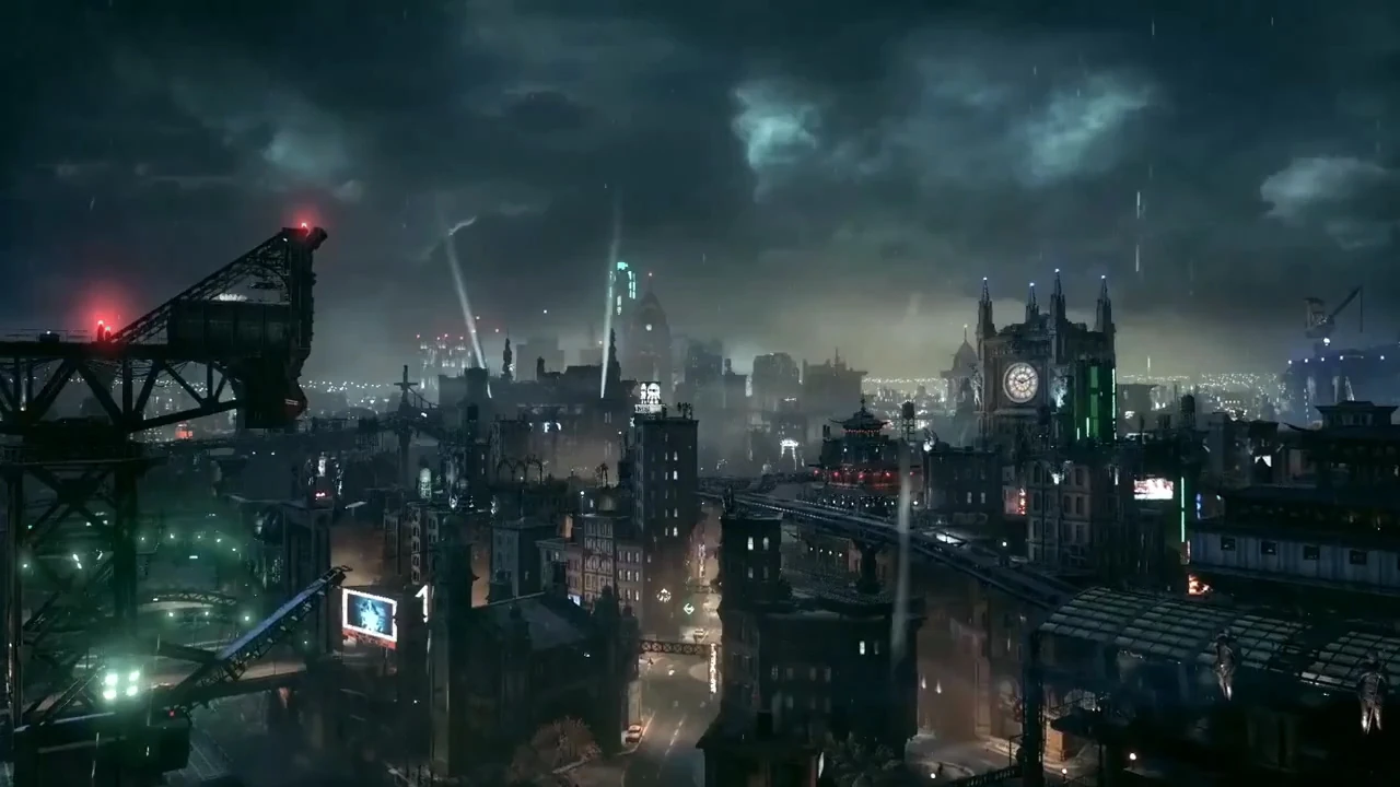
First of the locations is probably the most famous of all crime ridden, thriller-esque locations is Gotham City from the Batman franchise which has been in existence since 1939. It is the set archetype for locations as such and has been shown to be the gritty place where no one wants to live. Such has been the stage for a number of film franchises each visibly taking aspects from the age old creation which itself, has appeared in a number of incarnations (from based on Chicago, New York to a fictional built and in Batman vs Superman, Detroit).
Basin City from Frank Miller's Sin City saga is a secluded city trapped in a basin/sink hole. It was nicknamed Sin City for its noire apparel and violent history. What also adds to the 'rough city' is the predominant red light district where a large portion of the stories to do with Sin City take place.
Typography and Titles
Throughout media, written communication is presented in a variety of different ways. This can vary from font style to colour to font size. Choosing the typography with the most appealing aesthetics is extremely important. If the text looks odd &/or out of placed, then this can make the film/video look unprofessional & cheap. As most people will judge something by its appearance, It is important for the typography to look classy and well constructed to leave a lasting first impression. This will help avoid people's prejudgement of the movie/show to be negative.

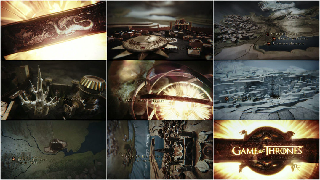
Typography can also be used to ascertain particular conventions of a genre that the media is part of. For example, the "Game Of Thrones" titles follows the aesthetic conventions that are commonly associated with the fantasy genre. The sleek colour scheme also gives it a more "adult" vibe to insinuate that it is intended for an older/maturer audience. The font style is also reminiscent of a regal theme which links with the content of the show which revolves around several royal houses/families competing to take the Iron Throne.

Similarly, the use of colour for the "Saw" titles also conveys mature themes. However, differences like the smear of red (which contains symbolic references to blood or danger) show that the theme for this movie is horror. The underlining of the word "Saw" looks like it has been slashed against a metal wall which shows a sense of victims becoming trapped & murdered. It is a common symbolic code for horror movies to include
Fantasy Genre
Typography can also be used to ascertain particular conventions of a genre that the media is part of. For example, the "Game Of Thrones" titles follows the aesthetic conventions that are commonly associated with the fantasy genre. The sleek colour scheme also gives it a more "adult" vibe to insinuate that it is intended for an older/maturer audience. The font style is also reminiscent of a regal theme which links with the content of the show which revolves around several royal houses/families competing to take the Iron Throne.
Horror Genre
Similarly, the use of colour for the "Saw" titles also conveys mature themes. However, differences like the smear of red (which contains symbolic references to blood or danger) show that the theme for this movie is horror. The underlining of the word "Saw" looks like it has been slashed against a metal wall which shows a sense of victims becoming trapped & murdered. It is a common symbolic code for horror movies to include
Titles and Openings
Game Of Thrones
Game of Thrones's Opening takes the audience on a fantasy-inspired journey throughout Westeros's current state during that season. Landmarks & locations known to the audience begin to form & take shape on the virtual map. The Actor's & Actress's names appear in the opening sequence next to a picture of their character's house sigil. For example, Maisie Williams's name is next to a picture of a Wolf because her character: "Arya Stark " is part of House Stark & their Sigil is a Wolf. The colour pallet is quite natural with whites, greens, blue & browns as they are the colour of the landscape - The white is used for snow, green for grass, blue for the ocean & the brown for rock/desert. Subtle tones of gold are used to convey a sense of regal superiority to tie in with the story of "fighting for the crown to rule Westeros." The final scene where the title is shown on the crown along with four house sigils in each corner shows the main contenders (Stark, Targaryen, Lannister & Baratheon) all are in for a chance of winning "The Game of Thrones." The art style of the visuals paired with the epic, well received music hints to the reader that this show will indeed be a unique, fantasy, battle that the audience will encounter twists & turns with unexpected outcomes - hence the intro showing the building of the locations on the map - you have to guess the outcome of what the outcome is going to be of the construction when first watching (Unless you know you already know the geographical aspects of Westeros).
Game of Thrones's Opening takes the audience on a fantasy-inspired journey throughout Westeros's current state during that season. Landmarks & locations known to the audience begin to form & take shape on the virtual map. The Actor's & Actress's names appear in the opening sequence next to a picture of their character's house sigil. For example, Maisie Williams's name is next to a picture of a Wolf because her character: "Arya Stark " is part of House Stark & their Sigil is a Wolf. The colour pallet is quite natural with whites, greens, blue & browns as they are the colour of the landscape - The white is used for snow, green for grass, blue for the ocean & the brown for rock/desert. Subtle tones of gold are used to convey a sense of regal superiority to tie in with the story of "fighting for the crown to rule Westeros." The final scene where the title is shown on the crown along with four house sigils in each corner shows the main contenders (Stark, Targaryen, Lannister & Baratheon) all are in for a chance of winning "The Game of Thrones." The art style of the visuals paired with the epic, well received music hints to the reader that this show will indeed be a unique, fantasy, battle that the audience will encounter twists & turns with unexpected outcomes - hence the intro showing the building of the locations on the map - you have to guess the outcome of what the outcome is going to be of the construction when first watching (Unless you know you already know the geographical aspects of Westeros).
Company Name Change - Mallard Media
After careful
consideration and general feedback from our target audience, we decided to
change our production company name which subsequently changed the final outcome
of the logo. Our new logo uses the contrasting tones of black & white to
create a subtle logo. Black & white also has convention of being
classy. Because of this, our new logo has a sense
of professionalism to it which further improves its appearance. Also
the black & white colour scheme is gender neutral which could appeal to
wider audience. "Mallard Media" has an alliteration sound to it so it
is more likely to make an impression on new audiences.

Risk Assessment
As part of our filming process we decided to conduct a "risk assessment" to help with our opening film. Attributes to consider were as followed:
Weather:
Attempt to shoot on a day where there is light but it is cloudy. Use of pathetic fallacy to reflect mood of film.
Careful not fall into lake:
When shooting scenes that require us to approach the lake in Cuckoo's Hollow, do not stand too close to the edge of the brush. Also be sure to not drop the camera in the lake in filming over the bridge or rails.
Neighbourhoods:
Do not make too much noise to disturb people living in the neighbourhood.
Beware of traffic:
Don't get hit by a car.
Beware of passer-bys:
Could accidentally get them in the footage without consent.
Alchemy scene:
Be careful not to cut self on equipment.
Don't drop glass bottles/jars.
Beware of any spillages.

Risk
|
Consequence
|
Risk chance
|
Precautions
|
Dropping camera while filming
|
Broken property and inability to film
|
Low
|
We will take regular breaks.
|
Canine interference
|
Pet dog(s) on set ruins take or post-production sound recording.
|
High
|
Ensure the dogs are in another location so they do not provide non-diegetic sound.
|
Road traffic accidents
|
Injury
|
Medium
|
Take standard road safety precautions when encountering roads.
|
Falling/tripping
|
Injury
|
Low
|
Be cautious when travelling by foot.
|
Camera breakage due to wind knocking over tripod
|
Camera is broken and the product is unable to be filmed.
|
Medium
|
Be vigilant of wind and hold onto tripod and camera at all times..
|
Filming location:
Weather:
Attempt to shoot on a day where there is light but it is cloudy. Use of pathetic fallacy to reflect mood of film.
Careful not fall into lake:
When shooting scenes that require us to approach the lake in Cuckoo's Hollow, do not stand too close to the edge of the brush. Also be sure to not drop the camera in the lake in filming over the bridge or rails.
Neighbourhoods:
Do not make too much noise to disturb people living in the neighbourhood.
Beware of traffic:
Don't get hit by a car.
Beware of passer-bys:
Could accidentally get them in the footage without consent.
Alchemy scene:
Be careful not to cut self on equipment.
Don't drop glass bottles/jars.
Beware of any spillages.
Sunday, 10 May 2015
Locations of Filming

This path will be the ideal location for the opening shots and also a shot to incorporate the urban background. The trees around created a good lighting effect that allowed us to shoot without the light being too bright.

This underpass is covered in graffiti making it good to set up an urban, gritty theme. The lighting had to be natural due to lack of lighting tools so we had to film on a particularly cloudy day so the contrast did not cause confusion.

Davids Lane is a very busy roundabout near an industrial park. This could work well as an establishing or filler shot to reinforce the gloomy feel and tone of the product.

Here at this location in Cuckoo's Hollow nature reserve, will be the concluding part of the opening sequence. It is loosely based on Netflix's The Killing to present influences and further reinforce gloominess.

The house on the left is where our group member Harry lives. He had a garage with good lighting and space for the Alchemy scenes. The garage wasn't regularly visited so there would be no sound contamination.
Wednesday, 6 May 2015
Costume and Props
Costumes & Props
Costume
Costume: Costumes are the distinctive style of dress/outfits which usually adjure to a certain genre or . A costume can be a particular style of clothing worn to portray the wearer as a character or type of character other than their regular persona at a social event such as a masquerade, a fancy dress party or in a theatre performance.
Props
Props: A property, commonly shortened to prop (plural: props), is an object used on stage or on screen by actors/actresses during a performance or screen production In practical terms, a prop is considered to be anything movable or portable on a stage or a set, distinct from the actors, scenery, costumes and electrical equipment. Consumable food items appearing in the production are also considered properties.
Costume ideas for our opening scene:
Costume for the Alchemist Keenan
Black Cloak
Black Trousers
Black Shoes
White T-shirt
.png) Props for the Alchemist
Vials
Jars
Cat
Herbs
Pestle Mortar
Rocks
Jewels
Skull
Bunsen Burners/Fire
Water
Books
Props for the Alchemist
Vials
Jars
Cat
Herbs
Pestle Mortar
Rocks
Jewels
Skull
Bunsen Burners/Fire
Water
Books

Costume for the Jon (Harry) & Pedro (Kieran) Dark coloured jacket Jeans White v-neck Black boots

Props for the Alchemist
Vials
Jars
Cat
Herbs
Pestle Mortar
Rocks
Jewels
Skull
Bunsen Burners/Fire
Water
Books
Costume for the Jon (Harry) & Pedro (Kieran) Dark coloured jacket Jeans White v-neck Black boots
Subscribe to:
Posts (Atom)